This week I created a mood board is good because I can refer back to it for inspiration whilst I am doing my photoshoot or designing my magazine.
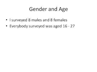
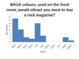
I designed my questionnaire and gave it to 6 males and 6 females of my target audience. I collected results which told me that:
My magazine should be priced between £2 – £2.99.
It should incorporate the colours black, red and white.
The images are the most important feature.
The image and layout seems to appeal to the target audience the most for the fornt cover
The layout is the most important feature of the contents.
The bright colour scheme attratcs people to the features article the most.
5 people said that my rock magazine should be named UPROAR.
I come up with flat plans which I can refer back to when making my magazine. The layout may change, this is just a guide.
I established my cast list and my photoshoot venue.
Saturday, 5 February 2011
Friday, 4 February 2011
Shooting Location
Cotton Park - Romford
Chosen because it is close to where I live and there are many features which will look correct in a rock magazine. I.e. grey, concrete fence with barbed wire and skater park.
Thursday, 3 February 2011
Wednesday, 2 February 2011
Monday, 31 January 2011
Mood Board
My mood board represents everything that will inspire me whilst creating my magazine. It represents the colour schemes, fonts, positioning, make-up and costumes which I am likely to use for my magazine.
Thursday, 27 January 2011
Weekly Update 3
From analysing two features articles, I have decided that in my features article, I will include:
- A page number at the bottom right hand side of at least one page with the magazine title next to it
- A big bold heading at the top of the page
- An introduction underneath the main heading
- Columns
- 2/3rds of the two pages taken up by a main image
- Shapes
- Connections to the front cover and/or contents page
- Quotations
I will also include a separate text box with separate text, to appeal to the reader.
From analysing two magazines, I depicted the main conventions of a rock magazine. This is good because I can either choose to follow or challenge these conventions.
I created a brainstorm to generate ideas for my magazine. E.g. I looked at mise-en-scene, typography, images, genre, colour scheme, magazine names etc. This has helped me to get a basic idea of what my magazine will look like and which aspects I am to include.
I created a brainstorm to generate ideas for my magazine. E.g. I looked at mise-en-scene, typography, images, genre, colour scheme, magazine names etc. This has helped me to get a basic idea of what my magazine will look like and which aspects I am to include.
I analysed the colours used in order to decide on a colour scheme for my magazine. My colour scheme will include black, red and white, and may also include blue and yellow.
I used images to represent who my target audience are. This is good because I am able to visualise who they are, and I can bare this in mind whilst creating my magazine.
Wednesday, 26 January 2011
Target Audience
My magazine will be aimed at males and females aged 16 - 25 who are interested in rock music.
Below are some images of the type of people I hope to attract with my magazine:
Monday, 24 January 2011
Colour Representation
In rock music magazines, the predominant colours are:
- Black
- White
- Red
- Yellow
- Baby Blue
All of the above are used for a specific reason...
Black and white are used because they are easy to read. They can also be a symbolism of death and danger, i.e.
Yellow is also used in various signs, and usually used to warn people of hazardous conditions or danger. Here are some examples - notice that in some cases, red and yellow is used together -
Rock is usually represented by very masculine men, hence the use of the colour blue. (However in the case of NME, baby blue is more feminine to attract females)...
Subscribe to:
Posts (Atom)


