I found creating my front cover fairly straight forward. It was sometimes challenging to stick to the original faltplan, and I found that a lot of the time, changes to the layout looked better. Here is the difference between my flat plan and the final product:
The masthead now takes up the full width of the page and the cover lines are not in the same places. The barcode, however, is in the original place.
Saturday, 26 February 2011
Friday, 25 February 2011
Construction of Front Cover
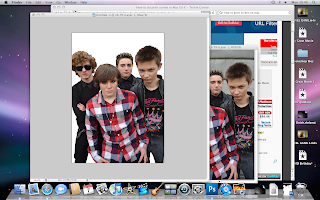
I began by cutting out my the band in my chosen original image.
I then began to create the masthead (see - 'masthead design'.)
I added a black strip at the very top of the page over the masthead, this would have white text in it.
I then wrote the text 'WIN' in red, and 'WIN A SIGNED COPY OF THE YM@6 ALBUM' in white. This would hopefully attract the target audience as they would know from this that they have the opportunity to win something.
I outlined the 'WIN' with white so that it showed up against the black background. I added coverlines in white text and outlined these with black. The main cover line overlaps a black rectangle, slanted to appeal to my target audience. I added another slanted rectangle in a dull red colour at the bottom of the page.
I found a splodge shape and cut this out using the cutting tool. I coloured this black and put it over the red, slanted banner at the bottom. I outlined the banner with a black, crackled effect in order to define the shape and make it stand out more. The outline makes it look slightly 3-dimensional.
I found a barcode, resized it, and placed it in the right hand corner of the page.
I used the shape tool to add more white space around the bar code in oder to make room for more text.
I used the text tool to add the date, the website address and the price in pounds and euros. The barcode already had an issue number on it. All of these components were included on the barcodes of Kerrang! and NME.
To follow conventions, I had to include another image and cover story and I decided to follow the style of Kerrang! (above, left), to do so I used the shape tool to create a white box, and placed an image over this (later to be replaced with an original image). I then wrote text, some black and some white with a red outline, for the cover line.
Over the red banner I added text and plus symbols to show the various bands featured in the magazine.
I replaced the small image with one of my own which I took from a gig that I went to.
Subscribe to:
Comments (Atom)


