Friday, 18 March 2011

Evaluation Question 4

4:Who would be the audience for your media product?

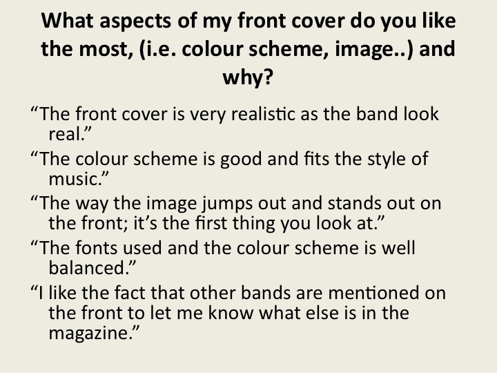
My media product represents people interested in rock music that are either in school, college, sixth form, university, or in a job.


School/sixthform/college– This social group arrives home at the end of the day, logs onto their computer, and listens to either their iTunes playlist of radio stations such as ‘XFM’, whilst doing work or relaxing. They save up money and make time to go to gigs to see bands at the weekend, occasionally on a weekday, and go with other friends who share the same interest. When they come across a rock music magazine, they will be inclined to buy and read it. Some may be regular readers.

University – People who go to university typically go out to enjoy themselves most nights. In this specific social group, people will tend to go out to see various small bands in their area. They may also sit in the library for example, plugged into their headphones listening to their favorite bands. Students interested in rock music at university will also be interested in buying my rock magazine, and may do so whenever they can afford to.

Younger people at work – People who are working are more likely to be able to afford my magazine each week, this is why the target audience age ranges from school age to working age. People working full time may still, on occasion, go to see bands.

Evaluation Question 3

3: What kind of media institution might distribute your media product and why?


I have created a short video to introduce the two main institutions likely to distribute my media product...


The fact that Bauer Media already publishes Kerrang!, Q and Mojo, will probably mean that Bauer Media will not distribute my magazine. This is because these magazines (especially Kerrang! and Mojo), are very similar to mine, and will therefore compete. This will not be beneficial to the institution who might loose sales on their existing magazines. 

IPC Media target three social groups, 'men', 'mass market women' and 'upmarket women'.  Therefore the institution does not currently aim any of their products at my young target audience. This may mean that it will not be interested in distributing ‘Uproar’, however if they did spot this gap in the market, competition would be minimal. 
IPC distribute NME however, which may compete slightly with my magazine. However I feel as though my magazine genre is more rock, and NME is more indie-rock, and this therefore increases the chances that IPC will distribute my magazine. 'Uncut' is also a brand which belongs to IPC, however I feel that the target audience for this magazine it a lot older, and so would not compete with UPROAR. I believe that IPC Media, especially as NME is already very successful and therefore the company is well experienced, would be the best institution to distribute my magazine.


Evaluation Question 2

2: How does your media product represent particular social groups?


My magazine is representative of young people, aged 16 – 25, who enjoy listening to rock music whenever they are able to, go to gigs whenever they can, and buy rock magazines when they can afford them.


This type of social group might typically wear, simple jeans, worn, or skinny, and t-shirts which might represent their favourite bands. They might also wear darker coloured clothing than others. This has been represented in my in my product by the dark clothing that I chose to dress my band in. The band wear mostly black, with the exception of Scott who wears black and red.


Boys might also wear their hair longer than most in this social group shown by the image below.
I have also represented this in my selection of cast as Scott’s hair is fairly long.


Sometimes boys belonging to these social groups might wear eyeliner (‘guyliner’), which has been represented by my band in my rock magazine through Scott and Gary, who both wear eyeliner. Jonathan also wears some eye make up. People in this social group who chose not to wear any make up at all are represented by Stuart, this was done because a lot of boys do not wear it.


Girls are represented in my magazine in a similar way. I chose to put make-up on my model, as in general, most girls wear make up. Often girls in this social group tend to wear thick, black eyeliner, therefore I applied black eye-liner around her eyes to represent this.


In my features article interview, I represented my social group by placing the band in the same one. They are within the age of my target audience and went to school like everybody else. It also discusses how their use of the internet site ‘Youtube’ helped them to become noticed. ‘Youtube’ is widely used, particularly by my target social group, in society today.

Evaluation Question 1

1: In what ways does your media product use, develop or challenge forms and conventions of real media products?

Tuesday, 15 March 2011

Post Questionnaire Results Overview


Post Questionnaire

Below is my post questionnaire. I gave candidates a copy of my completed magazine to refer to.


Gender
M/F


Age...............


Looking at my magazine, how many times do you think you would read 'UPROAR' in sixth months?
0
1-5
6-10
11-15
16-20
21+


Do you feel as though the price of the magazine  is suitable? If not, please state why, and what you would be prepared to pay.


Yes
No
Reason and price prepared to pay?..........................................................................................


Do the colour schemes used appeal to you?


Red and black        yes/no
Yellow and black   yes/no
Blue and white       yes/no


Which is your favourite feature of my magazine? (Please circle one)
Masthead (title of magazine)
Image on front cover
Layout
Typography (font size and text)
Colour Scheme


What aspects of my front cover do you like the most, (i.e. colour scheme, image..) and why?

..........................................................................................................................................................................................................................................................................................................................................................................................

What aspects of my contents page do you like the most and why?

..........................................................................................................................................................................................................................................................................................................................................................................................

What aspects of my features article do you like the most and why?

..........................................................................................................................................................................................................................................................................................................................................................................................


What would you do to improve my magazine?
..........................................................................................................................................................................................................................................................................................................................................................................................

Rece Pictures


Saturday, 12 March 2011

Weekly Update 9

This week I constructed my features article. I did this whilst refering to all my previous research on features articles. I tried to follow the conventions as well as possible.

This construction took me the least time out of all three. Probably because, by this point, I have gotten used to using Photoshop CS3.

Here are the differences between the original flat plan and the final result:


Monday, 7 March 2011

Construction of Features Article

I first created a page with the correct dimensions of two A4 pieces of paper. I then divided this in half with the line tool.

I then added an image (which I darkened) onto the page, overlapping the half way point.
I also added a blue shape for the white, bold, title to go over, as well as text above and below this. I then wrote an introduction to my article.

I added a blue shape which an extra part of my article would go in later.

I then added the 'splodge' shape in white to this box. This is a common feature throughout my magazine.

 
I changed the font from a plain bold font, like on the front cover, to a crackled font for effect. I also darkened the blue so that the title is slightly different from the rest of the article and to draw attention. I also created an black, 'noise' effect coming from the blue banner. This helps to create a rock vibe.

I then added in my article. The interviewers words in blue, and the band's words in black. I arranged the text into columns like in other rock magazines I have read. 
I added a quote over the image like in NME. I used the crackly font, the same as the title, and outlined this with white to show up well. I placed the quote at a slant to add variation to the page and make it more visually appealing to my reader. A caption was placed in the bottom right hand side of the image in order to tell my reader who in band, is who. This makes for easy reading.
I also added the text, 'Words and images by Zara Dorman', as I noticed that all articles in real magazines did this.